Dawsome was an interaction design class project that I created over the course of a semester. The project
revolved around the design process: researching, interviewing,
wireframing, prototyping, usability testing, and branding. You can view the
Dawsome presentation to quickly learn about the idea and design process, or experience the product in browser.
You can also explore the individual stages below:
The initial assignment of the class was to interview a variety of people about their daily frustrations. I created
personas based on my interviews
Being a musician, I am around a lot of people who are in bands and I discovered through conversation many of my friends were having trouble managing practice schedules, gig availability, and new song development over text message
and Facebook Messanger.
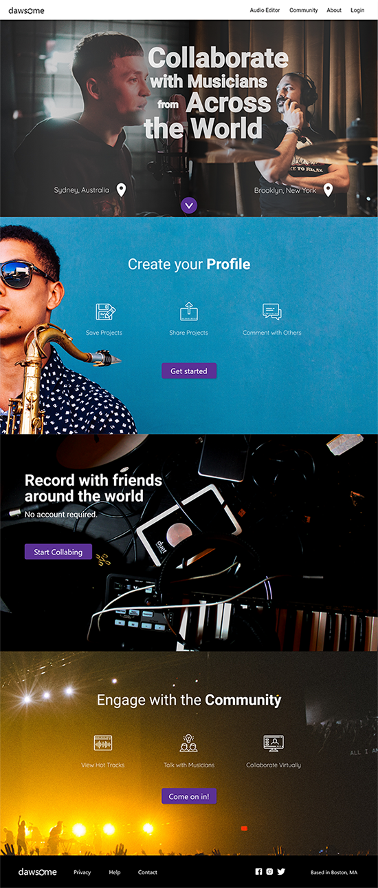
So, I decided I wanted to create a collaborative, real-time Band Manangement System and I'm thinking it's going to look like a calendar,
message board, and file storage system all wrapped up into one experience for bands.
Once I landed on that concept, I conducted more interviews to determine what features and capabilities would be the most valuable to this audience, which I formally defined as the amatuer band.
In my conversations, I discovered two very important things:
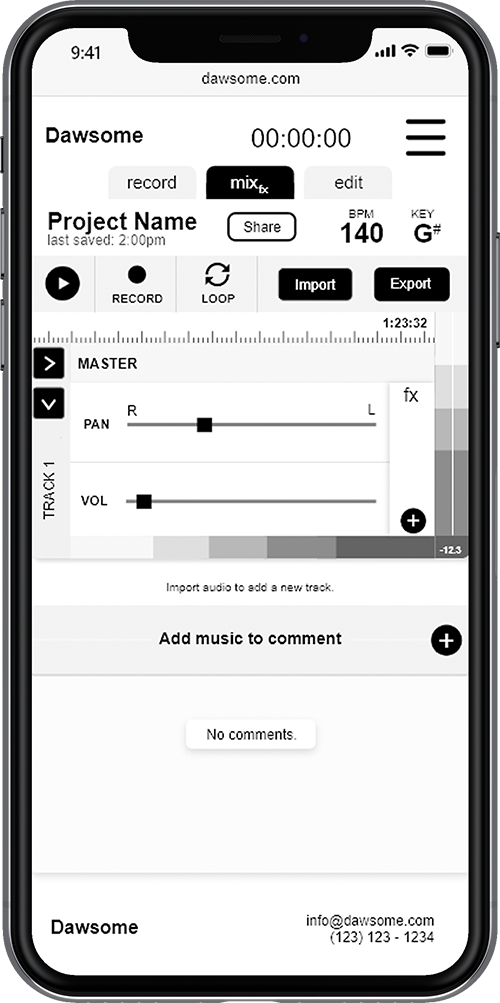
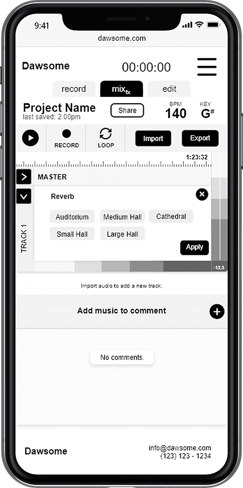
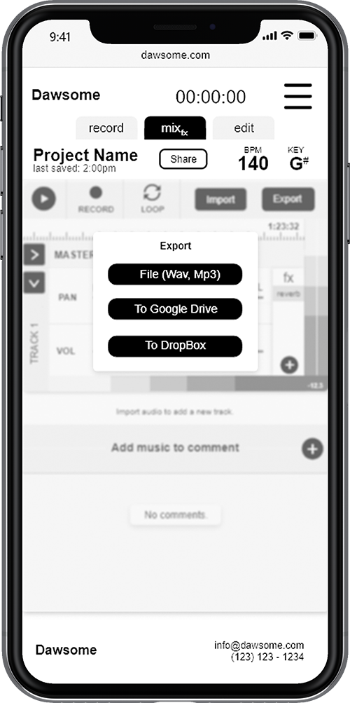
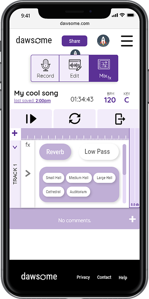
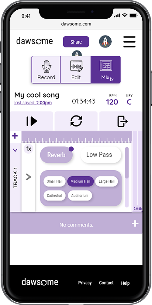
This is when I decided to pivot my project into a real-time, collaborative Digital Audio Workstation (DAW), a platform where musicians can record together virtually.
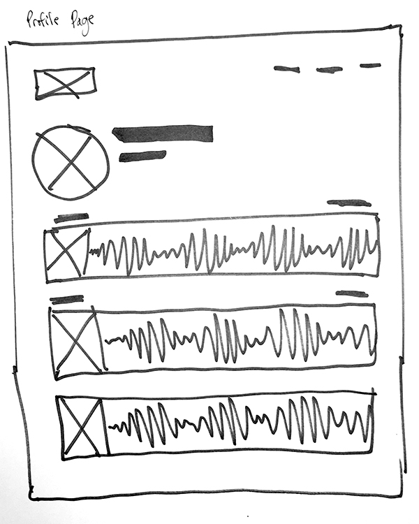
With the information from my interviews, I started to come up with concepts for the platform.
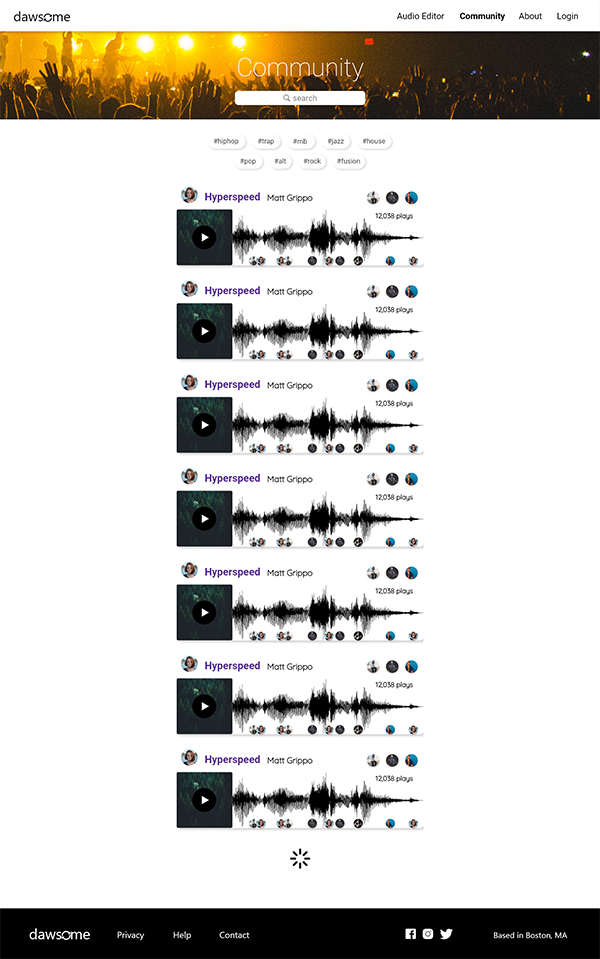
I wanted the site to let users comment on songs at a certain point in time. I benchmarked services like Soundcloud for its interaction and social features, and Garageband for its audio editting user interfaces. DAWs require a lot of functionality to be useful but I wanted to simmer it down to the basics for a simple user experience.
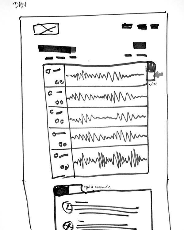
The prototype created from my designs was centered around three user tasks:
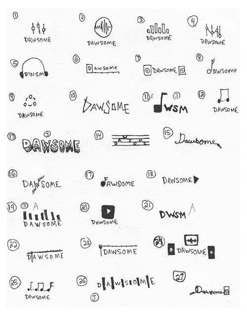
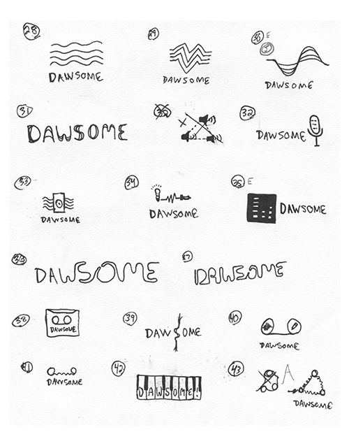
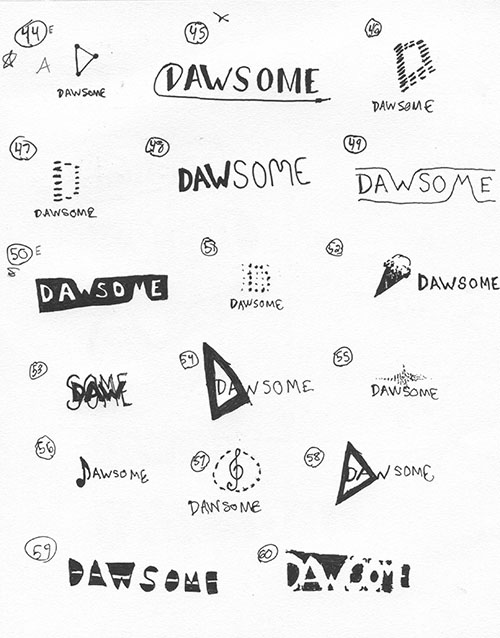
In the gallery is a series of concept ideas for a Dawsome logo. The brainstorm helped me to consider what the essence of the service was and how it could be be represented visually.
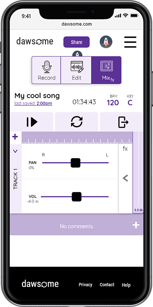
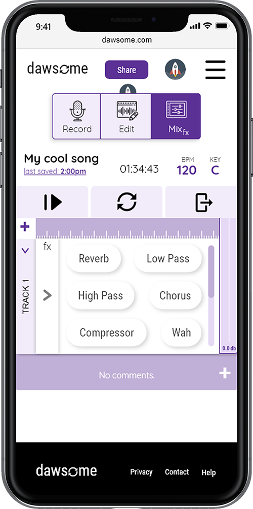
But as the design of the prototype came together, I decided to use the loop icon from the DAW
in the logo, replacing the "o". The icon and logo represent the collaboration of
musicians and the cycle of work that becomes a song.
Testing the prototype of my design allowed me to identify areas
within the design that were confusing and an interuption to
user workflows.
I wanted to create a interface that was simple and reduced the amount of ambiguity exposed to the
user. I incorporated learnings from my tests to make an interface that was easy to understand
from the start.
I was also able to add color.
You can check out the laptop versions of the workflows here.